Official Rules
To commemorate the 140th anniversary of the completion of Gin no Bashamichi (Old Silver Mine Carriage Road), the Silver Brawler Network Association requested that Issay Kitagawa—a leading Japanese designer and representative of GRAPH Co. Ltd., headquartered in Kasai, Hyogo—redesign the association’s logo mark to better suit future expansion beyond the region and overseas. To ensure the logo mark becomes familiar to all who view it, we intend to use this design as a visual communication tool for many years to come.

Logo Mark Design Concept for Gin no Bashamichi
The logo mark is designed to represent a road. Whenever geographical conditions allowed, Gin no Bashamichi was designed to provide a straight path from the north to the south through the lowland terrain. The logo mark was designed to reflect this idea. Although Gin no Bashamichi was prominent in the Meiji period, the intended audience is the people in the present day. As such, the graphic needed to be something capable of tying together both the Meiji period and common trends. In other words, I decided that the design needed to be a combination of both nostalgia and novelty. With these thoughts in mind, I designed a simple logo mark based on various ideas described below.
About the Logo:
The Chinese characters in the Japanese logo were designed with classical characters in mind. The Western logo incorporates rounded curves that bring to mind the rounded shapes of horseshoes. Both designs were created to incorporate a sense of familiarity while boasting a modern typography feel.
Development of the Logo Mark:
In order for Gin no Bashamichi to become a more attractive sightseeing resource, a new approach was required to differentiate the destination from others and to make the road more competitive. This mark was developed as the symbol of the Gin no Bashamichi brand with the assumption that it would be used with a variety of other exciting developments including brand foods, souvenirs, and events. Such efforts include newly developed Gin no Bashamichi original souvenirs, the “Gin no Bashamichi Idea Grand Prix” designed to foster excellent ideas for increasing excitement in the area, and a planned Gin no Bashamichi Gourmet Contest. The mark and logo used in such instances will become a recognizable decoration used as a design motif and will form a brand through the various developed forms—from similar packaging for food and souvenirs to banner designs created for various events. Through brand recognition and the resulting knowledge that an exciting pathway such as Gin no Bashamichi exists, we expect an inflow of a new class of tourists who, for example, realize that they can visit Takeda-jo Castle Ruins in Asago City and then follow Gin no Bashamichi straight to Himeji City and the Himeji-jo Castle World Heritage Site.
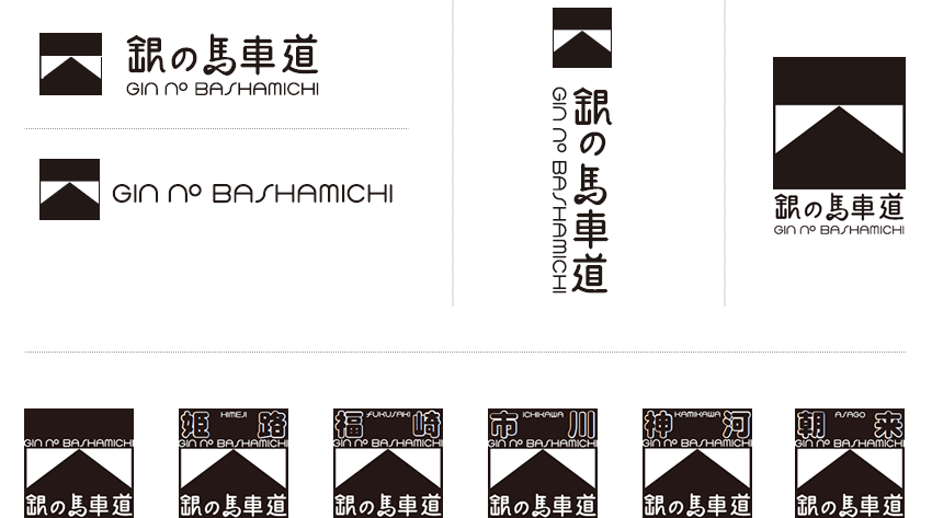
It is my hope that this logo mark is used affectionately by the locals throughout the areas along Gin no Bashamichi spanning multiple municipalities. Achieving this goal meant developing a design where no single area in particular stands out. The area at the top of the mark can be used for the name of each municipality along Gin no Bashamichi, guaranteeing the possibility for originality in each municipality despite the overall design being unified. The logo mark is also designed with consideration for ease of use as the square shape ensures easy placement on any layout for any media.

*Selected examples of logo mark and logo type combinations


Issay Kitagawa
Representative / Head Designer, GRAPH Co. Ltd.
Issay Kitagawa was born in Kasai, a city in Hyogo Prefecture, in 1965. Mr. Kitagawa graduated from the University of Tsukuba in 1987 and joined GRAPH Co. Ltd. (formerly Kitagawa Shiki Printing Co.) two years later in 1989. In 2001, he was featured in “NEW BLOOD” (published by Rikuyosha Co. Ltd.) as one of 20 up-and-coming figures in art, architecture, and design in Japan. Mr. Kitagwa was also elected a member of the Alliance Graphique Internationale (the world’s premiere design organization composed of about 250 top designers around the world) in the same year. A large number of his works were permanently stored in the Bibliotheque Nationale de France as excellent examples of modern printing and design in 2004. In autumn 2011, Mr. Kitagawa was selected as one of 15 contemporary Japanese graphic design artists featured in an exhibition held at the Centre Pompidou in Paris. A large number of clients—from small- to medium-sized enterprises within Japan to famous overseas luxury brands—are enamored by Mr. Kitagawa’s interest in technology aimed for “printing that cannot be thrown aside” and his proposal of “Design as a Management Resource” from the perspective of both managers and designers. He has been featured in numerous broadcasts including NHK WORLD’s “DESIGN TALKS plus,” TV TOKYO’s “Cambria,” and NHK’s “Luzon’s Pot.” His literary works include “Changing Values” (published by Works Corporation Co., Ltd.) and the special interest book “Branding Mettle — Business Operations of the World-Leading GRAPH Printing Company” (published by Nikkei Business Publications).
